Does your Brand ID Accurately Reflect Your Brand?
Keith Borshak
Creative Director
Does Your Brand ID Accurately Reflect Your Brand?
If not, right now may be the perfect time to reassess, re-evaluate, and revitalize your brand.
Ad agencies and design shops will often approach Brand Revitalization as an opportunity to start from scratch and put their own thumbprint on an existing brand or simply tweak the existing brand ID to bring it up to date. Too often, marketers are eager to shake things up and allow an agency to walk away from nearly every aspect of their brand ID, for good or bad. New color scheme, new typography, new look, tone, and feel, etc. Sometimes, however, that is genuinely needed, especially if the current Branding doesn’t truly sync up with what is at the core of a brand.
A shining example of this is Pro Contracting Services.

Pro Contracting Services is a privately owned family business with a concentration in Asphalt Resurfacing. Prior to working with us, ownership suspected that the brand ID might not accurately reflect what is at the core of their brand. Digging into the business and educating ourselves on what makes this company tick, we quickly realized that the current ID, the road construction character, and the winding highway illustration were problematic at best.
While disarming and kinda cute, the logo really didn’t convey the right message. Neither did the tagline.
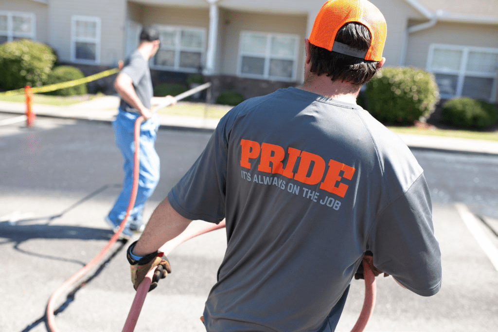
PCS is a company that operates on the notion that when you take pride in your job, it shows.
We Went to Work
First Flight’s crew dug in and created a look, tone of voice, and feel centered around one simple idea; PRIDE. The overall look would be bold, clean, and well organized.
With a new look and new tagline that reflects the brand, new brand communications have been developed. From shirt and truck graphics to a new website, across the board, PCS has a new look that they can be proud of.


